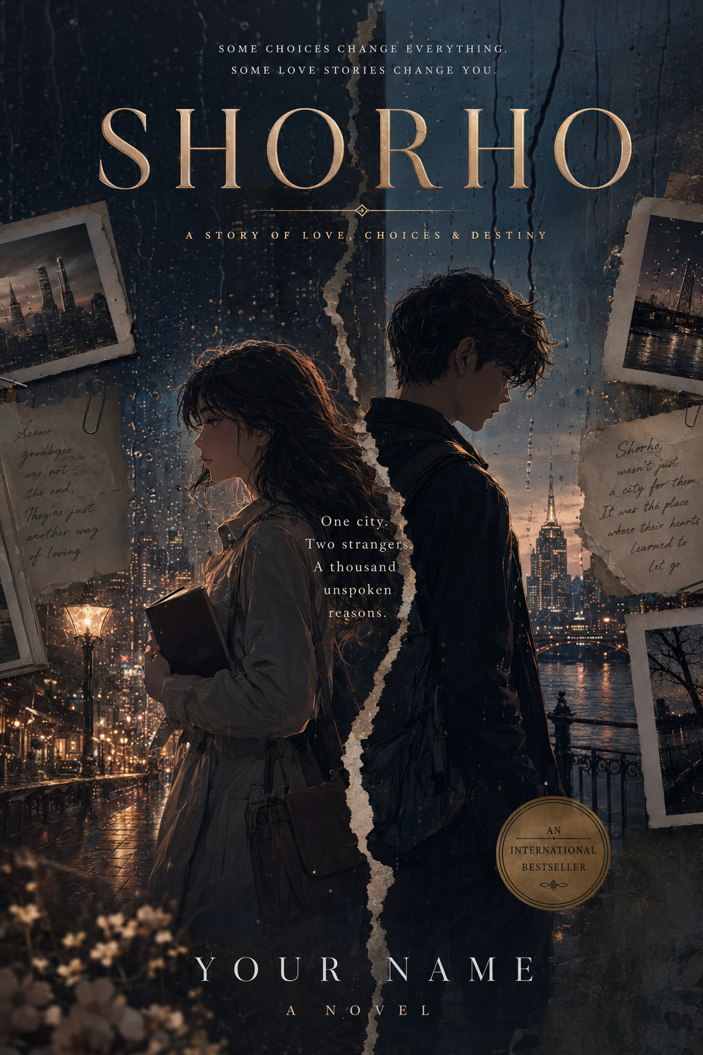
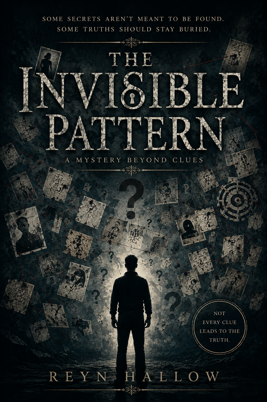
04 · Cover Design Academy

Design a Book Cover That Gets Attention

Learn how to create professional book covers, select effective typography, position your book for the correct genre, and prepare cover files for digital and print publishing.

A book cover is often the first part of your book that readers see. StoryMaster AI helps you turn your title, genre, audience, and visual direction into a polished cover that represents your book clearly and professionally.

4 lessons 20-minute track Beginner to intermediate Reading tutorial
0 of 4 lessons completed0%
A Letter
to August

Romance

A Letter to August

Sienna Cole

THE
SILENT
ROOM

Mystery

THE SILENT ROOM

J. HOLLOWAY

Young-Adult Fantasy

THE DOORWAY MAKER

A Young Inventor's Adventure

ARIAN VALE

Lesson 1 of 4 5 minutes

Creating Covers

A professional book cover should communicate the book's genre, mood, subject, and audience within a few seconds.

Readers often see the cover before they read the title, description, or sample pages. This makes the cover an important part of the book's identity and positioning.

StoryMaster AI helps users generate book cover concepts based on the book's content, title, genre, target audience, and preferred visual style.

Visual Comparison · Direction

Weak direction

"Create a fantasy cover."

Too vague. Results in generic elements, unreadable text placement, and wrong audience targeting.

Strong direction

"YA fantasy about a young inventor. Deep blue tones, glowing doorway, gold serif title."

Provides clear genre, mood, subject, colour palette, and typography placement for StoryMaster.

Begin with the book itself

A strong cover begins with a clear understanding of the book.

Before generating a cover, define:

  • Book title
  • Subtitle, if applicable
  • Author name
  • Primary genre
  • Secondary genre
  • Target audience
  • Main theme
  • Emotional tone
  • Important character or symbol
  • Preferred colour direction
  • Publishing format

The cover should represent the book accurately.

A dramatic thriller cover should not look like a light romance. A children's adventure should not look like an academic textbook.

Focus on one central idea

A cover does not need to show every character, location, event, or idea from the book.

Too many elements can make the design confusing.

A stronger cover usually focuses on one main visual idea, such as:

  • A central character
  • An important object
  • A symbolic image
  • A distinctive location
  • A powerful colour treatment
  • A strong title treatment

Weak and strong cover directions

Weak direction

Create a beautiful cover for my fantasy book.

This does not give StoryMaster enough information.

Stronger direction

Create a professional cover for a young-adult fantasy adventure about a teenage inventor who discovers a machine that opens hidden worlds. Use a mysterious workshop, a glowing circular doorway, deep blue tones, warm gold lighting, and a cinematic storybook style. Leave clear space for the title and author name.

The stronger direction defines

  • Genre
  • Audience
  • Main concept
  • Setting
  • Mood
  • Colour palette
  • Illustration style
  • Text placement

Cover composition

A balanced book cover normally includes:

  • Clear focal point
  • Readable title
  • Appropriate subtitle
  • Author name
  • Strong visual hierarchy
  • Space around important elements
  • Suitable contrast
  • A composition that works as a thumbnail

The title should not compete with the artwork.

Design for thumbnail size

Many readers first see books as small images on Amazon, social media, online bookstores, or search results.

At thumbnail size:

  • The title should remain readable
  • The main image should remain recognisable
  • The design should not depend on tiny details
  • The contrast should remain strong
  • The genre should still be understandable

Always review the cover at both full size and thumbnail size.

Generate multiple concepts

Do not accept the first design automatically.

Create several cover directions, such as:

  • Character-focused
  • Object-focused
  • Symbolic
  • Minimalist
  • Environment-focused
  • Typography-led

Compare which concept communicates the book most effectively.

Review before approval

Ask:

  • Does the cover match the genre?
  • Is the title readable?
  • Is the main idea immediately clear?
  • Does it appeal to the intended audience?
  • Does it work at thumbnail size?
  • Is the design too busy?
  • Does it look professional?
  • Does it accurately represent the book?
StoryMaster AI cover prompt example

Create a front cover for a young-adult fantasy adventure titled "The Doorway Maker." Show a teenage inventor standing inside a shadowed workshop beside a glowing circular machine that opens into a mysterious world. Use deep blue, bronze, and warm gold tones. Keep the composition cinematic, polished, and suitable for Amazon Kindle and paperback publishing. Leave clear space for the title at the top and the author name at the bottom.

Key takeaway

A strong cover focuses on one clear visual idea and communicates the book's genre, mood, and audience immediately.

Lesson 2 of 4 5 minutes

Typography

Typography is the way text is designed and arranged on a book cover.

It includes font selection, size, spacing, alignment, colour, position, hierarchy, and readability.

A powerful image can still produce a weak cover if the title is difficult to read or the typography does not match the genre.

Typography Matching by Genre

Fantasy

ELDRITCH

Serif / Elegant / Gold

Thriller

SILENT ECHO

Bold Sans / Condensed

Children's

Barnaby's Big Day

Rounded / Playful / Soft

Establish text hierarchy

The reader should quickly understand which text is most important.

A common hierarchy is:

  • Book title
  • Subtitle
  • Author name
  • Series information
  • Supporting text, when necessary

The title normally receives the greatest visual emphasis.

Match typography to genre

Typography should support the book's category and tone.

Fantasy

May use:

  • Elegant serif fonts
  • Decorative letterforms
  • Strong title treatments
  • Historic or magical influences

Thriller and mystery

May use:

  • Bold condensed fonts
  • Sharp sans-serif styles
  • High contrast
  • Strong capital letters

Romance

May use:

  • Elegant serif fonts
  • Refined scripts
  • Soft spacing
  • Emotional presentation

Children's books

May use:

  • Friendly rounded fonts
  • Playful letterforms
  • Clear bold text
  • Bright visual treatment

Business and nonfiction

May use:

  • Clean serif fonts
  • Modern sans-serif fonts
  • Strong hierarchy
  • Minimal decoration

Science fiction

May use:

  • Geometric fonts
  • Modern sans-serif styles
  • Futuristic spacing
  • Clean technical details

Prioritise readability

A title should remain readable:

  • On mobile
  • At thumbnail size
  • Against the background
  • In light and dark settings
  • When displayed on online stores

Avoid

  • Low contrast
  • Very thin fonts
  • Complex backgrounds behind the title
  • Excessive effects
  • Too many font families
  • Overly tight spacing

Use contrast effectively

Text should stand apart from the artwork.

Methods include:

  • Light text on a dark background
  • Dark text on a light background
  • Subtle shadows
  • Soft overlays
  • Clear negative space
  • Simple background treatment behind the title

Do not use effects only for decoration.

Limit the number of fonts

Most professional covers use one or two font families.

A practical approach is:

  • One distinctive font for the title
  • One simple font for subtitle and author name

Using too many fonts makes the cover look inconsistent.

Title placement

Common title positions include:

  • Top
  • Centre
  • Lower third
  • Integrated into the artwork
  • Framed inside a clear text area

The correct position depends on the image composition.

Do not cover important faces, objects, or story details unnecessarily.

Subtitle and author name

The subtitle should support the title without competing with it.

The author name should be visible, but its size depends on the author's brand recognition and the cover style.

For a new author, the book title usually receives more emphasis than the author name.

Typography review checklist

  • Is the title readable immediately?
  • Does the font match the genre?
  • Is the hierarchy clear?
  • Is there enough contrast?
  • Are there too many fonts?
  • Does the title work at thumbnail size?
  • Is the author name positioned correctly?
  • Is the text aligned consistently?
StoryMaster typography example

Title: The Doorway Maker

StoryMaster prompt addition: Use a strong, elegant serif font for the title "The Doorway Maker." Place the title in the upper third using warm gold lettering with clear contrast. Keep the author name smaller at the bottom in a clean sans-serif font. Ensure all text remains readable at Amazon thumbnail size.

  • Strong elegant serif font
  • Large title at the top
  • Warm gold lettering
  • Clear contrast against a dark blue background
  • Moderate spacing between letters
  • Simple sans-serif author name at the bottom
Key takeaway

Effective typography makes the title easy to read, strengthens genre recognition, and gives the cover a professional identity.

Lesson 3 of 4 5 minutes

Genre Positioning

Genre positioning means designing a cover that helps the correct readers recognise the type of book immediately.

Readers develop expectations based on familiar cover styles.

A cover that ignores these expectations may be visually attractive but still fail to reach the intended audience.

Genre Cover Variations

A Letter
to August

Romance

A Letter to August

Sienna Cole

Romance
THE LAST
EMBERWOOD

Fantasy

THE LAST EMBERWOOD

Book One of the Ashen Crown

ELIRA VANCE

Fantasy
THE
SILENT
ROOM

Mystery

THE SILENT ROOM

J. HOLLOWAY

Mystery

Young-Adult Fantasy

THE DOORWAY MAKER

A Young Inventor's Adventure

ARIAN VALE

YA Adventure

Why genre positioning matters

A reader browsing Amazon or another bookstore often makes decisions quickly.

The cover should help answer:

  • Is this fiction or nonfiction?
  • Is it written for adults or children?
  • Is it serious, humorous, romantic, educational, or suspenseful?
  • Does it match the books I normally read?
  • Does it look trustworthy and professionally produced?

Study the visual language of the genre

Every category has common visual patterns.

These may include:

  • Colours
  • Fonts
  • Image styles
  • Layouts
  • Character presentation
  • Symbols
  • Levels of detail
  • Emotional tone

The objective is not to copy another cover. The objective is to understand what readers expect.

Fiction positioning examples

Fantasy

Common elements may include:

  • Magical environments
  • Dramatic lighting
  • Symbolic objects
  • Detailed characters
  • Rich colour palettes
  • Elegant serif typography

Mystery and thriller

Common elements may include:

  • Dark contrast
  • Isolated locations
  • Shadows
  • Bold typography
  • Tension
  • Limited colour palettes

Romance

Common elements may include:

  • Emotional character focus
  • Warm or soft colour palettes
  • Elegant typography
  • Symbolic romantic imagery
  • Clear emotional tone

Children's books

Common elements may include:

  • Expressive characters
  • Bright colours
  • Clear shapes
  • Friendly typography
  • Simple visual storytelling
  • Age-appropriate illustration

Nonfiction positioning examples

Business

Common elements may include:

  • Clean typography
  • Bold title hierarchy
  • Minimal design
  • Strong geometric structures
  • Professional colour palettes

Self-development

Common elements may include:

  • Clear title
  • Aspirational imagery
  • Simple symbols
  • Bright or confident colours
  • Accessible design

Educational books

Common elements may include:

  • Clear subject focus
  • Structured design
  • Informative visuals
  • Trustworthy typography
  • Readable subtitles

Memoir

Common elements may include:

  • Portraits
  • Personal objects
  • Meaningful locations
  • Emotional photography or illustration
  • Elegant typography

Avoid misleading covers

A cover should not attract the wrong reader.

Examples:

  • A serious leadership book should not look like a children's activity book
  • A children's fantasy should not look like adult horror
  • A romance novel should not look like a technical manual
  • A mystery should not look like a light comedy unless that combination is intentional

Balance familiarity and originality

A successful cover should feel familiar enough to belong in its genre, but distinctive enough to be remembered.

Use familiar signals such as:

  • Appropriate typography
  • Recognisable colour treatment
  • Relevant imagery
  • Suitable composition

Then add originality through

  • A unique central symbol
  • A distinctive character
  • An unusual colour accent
  • A memorable title treatment
  • A strong visual concept

Compare with related books

Place your draft cover alongside published books in your category.

Ask:

  • Does it look like it belongs in the same quality range?
  • Does it stand out without breaking genre expectations?
  • Is the title readable next to competing covers?
  • Does the visual tone communicate the story correctly?
Genre positioning prompt example

Position "The Doorway Maker" as a young-adult fantasy adventure using a dark magical background, gold title lettering, a central glowing doorway motif, and a storybook fantasy illustration style that appeals to readers aged 12–16.

  • Target audience: Readers aged 12–16
  • Genre signals: Glowing doorway motif, dark magical palette, gold serif title
  • Tone: Adventurous, mysterious, hopeful
  • Competitive position: Balances classic fantasy elements with a modern young-adult adventure look
Key takeaway

A successful cover respects genre expectations so the right readers recognise the book, while using a strong visual concept to stand out.

Lesson 4 of 4 5 minutes

Publishing Covers

Publishing covers means turning a design concept into publication-ready files for digital and print platforms.

An eBook cover requires a single front cover image optimized for screens.

A print paperback or hardcover requires a complete full-wrap cover including the front cover, spine, and back cover formatted to exact dimensions.

Paperback Full-Wrap Cover Anatomy

BACK COVERBlurb · Tagline · ISBN Barcode
ISBN
SPINE
FRONT COVERTitle · Illustration · AuthorPrimary Focal Point

eBook cover requirements

For Amazon Kindle, Apple Books, Kobo, and Google Play, eBook covers usually require:

  • Single front image only
  • JPEG or PNG format
  • RGB colour mode
  • High resolution (recommended 1600 × 2560 pixels)
  • 1.6:1 height-to-width ratio
  • Clear title and author text visible at thumbnail size

eBook covers do not require a spine or back cover.

Print paperback cover requirements

A paperback cover for Amazon KDP or IngramSpark requires a single continuous PDF containing:

  • Back cover (left side)
  • Spine (middle section)
  • Front cover (right side)
  • Bleed margin (typically 0.125 inches / 3.2 mm around all edges)
  • Safe area for text and essential graphics
  • CMYK colour mode for accurate printing

Understanding the spine width

The spine width depends directly on the number of pages and the paper type chosen for print.

Formula example:

  • White paper paperback spine = page count × 0.00225 inches
  • Cream paper paperback spine = page count × 0.0025 inches

Always calculate page count before finalizing a print spine.

Spine text is usually omitted for books under 80 pages because the spine is too narrow.

Back cover elements

A complete back cover includes:

  • Book description or blurb
  • Category tag or tagline
  • Author bio and photo (optional)
  • Reviews or endorsements (optional)
  • Barcode and ISBN placeholder
  • Publisher logo or website URL

Leave a clear 2 × 1.2 inch area in the lower right corner for the ISBN barcode.

Common printing mistakes to avoid

  • Text placed too close to the trim edge
  • Incorrect spine width based on wrong page count
  • Low-resolution images (under 300 DPI)
  • Barcode area covered by background graphics or text
  • Using RGB colour mode for print export
  • Missing bleed area resulting in white edges after trimming

StoryMaster export workflow

StoryMaster AI handles file preparation automatically:

  • Generate front cover image for eBook export
  • Calculate spine width automatically from manuscript page count
  • Generate back cover layout with blurb and barcode placeholder
  • Export 300 DPI print-ready PDF with bleed and crop marks for KDP
Print cover specification example

Book: The Doorway Maker (Paperback)

Trim size: 6 × 9 inches | Page count: 240 pages (Cream paper)

Spine width: 0.60 inches

Total cover dimensions: 12.85 × 9.25 inches (including 0.125 inch bleed)

Export format: 300 DPI CMYK PDF print-ready for Amazon KDP

Key takeaway

eBook covers require a single high-resolution RGB front image, while print covers require a full-wrap CMYK PDF calculated with exact spine width and bleed margins.

Track completion

Complete all four lessons to finish this track

0 of 4 lessons completed·0% complete
1.5k+
Happy Authors

Join Our Author Community

Get writing tips, publishing hacks, and the latest updates from StoryMaster AI straight to your inbox.